“Nothing is as practical as a good theory”
— Kurt Lewin
We’ve talked about how the SysQ Mindset (AIM) helps us deal with complexity instead of just making things simpler, and how the SysQ Thinking Skill Set (APTITUDE) helps us figure out how our challenges are connected. Now, we’ll show you how to use these skills to put them into action in a three-step process: Sensemaking, Solving, and Implementing & Learning. These are the things we need to do to move from a problem to a solution in a way that helps us learn the most.
This process isn't just another framework - when infused with the SysQ Mindset and Thinking Skills, it becomes a powerful, yet practical, approach helping us find genuine leverage points in complex systems while avoiding the common pitfalls of rushed solutions and unintended consequences.
This process isn’t just another way to do things — when we use the SysQ Mindset and Thinking Skills, it becomes a powerful and practical way to find real opportunities in complex systems. We can avoid the common mistakes of rushing to solutions and making things worse.
Think of this process as the guide that shows us how to use the SysQ AIM and APTITUDE. While the steps seem simple, they challenge our natural tendency to jump to solutions before we really understand the problem. By following this process, we can move beyond just fixing things to make real, lasting changes in our organizations and communities. This process helps us answer three important questions: Are we working on the right problems? Do we really understand what’s driving them? And are we creating solutions that work?hoosing solutions that will create sustainable improvement rather than temporary relief?
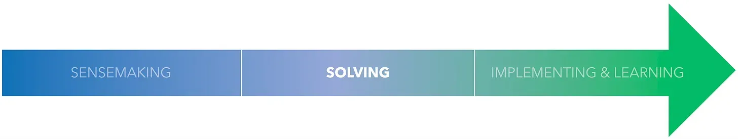
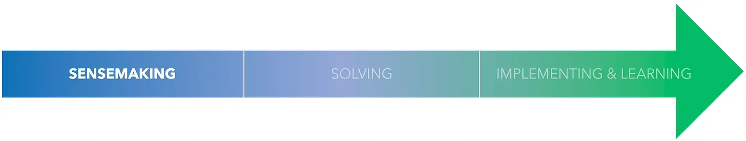
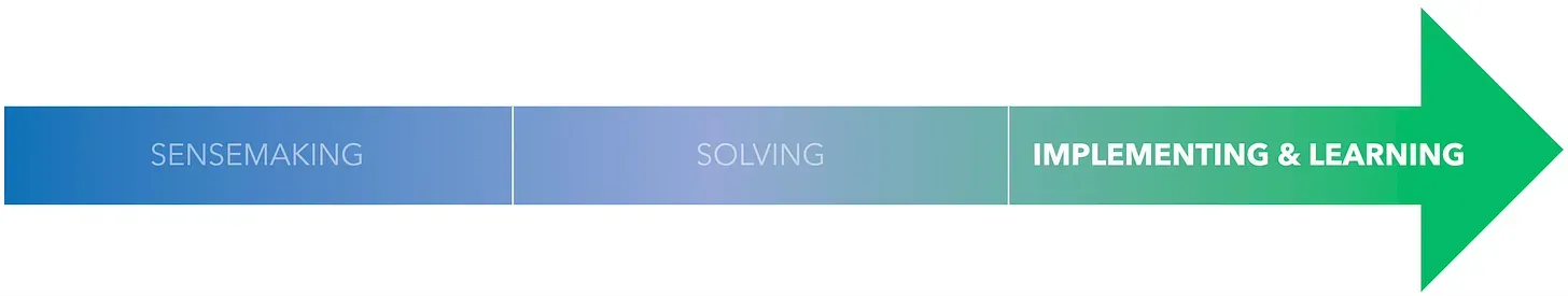
The SysQ Process has three steps that are like a loop. These steps are called phases in the “finding leverage” process:
1. Sensemaking
2. Solving
3. Implementing & Learning
A. SENSEMAKING
 To truly improve a situation, we need to understand the underlying forces driving the problem. Often, we jump straight into solutions without fully grasping the root cause. A common mistake is assuming we know what’s causing a problem and moving on to the next step.
The real issue with ineffective strategies is often that we choose the wrong problems to work on. We’ve poorly framed the problem, and that’s why our efforts aren’t making a difference.
Let’s say I want to improve my child’s grades. I might think the problem is their focus and persistence in studying. So, I’ll give them money as a reward. This might work in the short term, but the real problem is likely their intrinsic motivation. And the cause of that might be low self-worth or self-efficacy. If that’s the case, then the reward solution was the wrong approach for the right problem.
This is like building a great ladder and then leaning it against the wrong wall. To make sense and build a successful strategy, we first need to choose the right performance issue to improve. We need to pick the right wall.
Even if we take the time to frame the right issues, we still often just jump to solution mode. We start building our favorite ladder without thinking about the bigger picture.
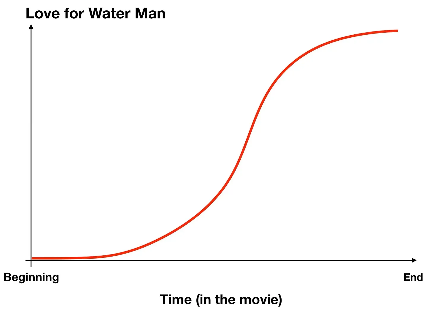
In the example of my child’s grades, we might react by giving them words of encouragement. You’re smart. You can do it. But then, our child might reject those words and even argue with us. We might get frustrated, and the wall might include a fixed or stuck mindset: I’m bad at math.
To climb the right wall, we need to identify the fixed mindset. Instead of labeling our child as “good at math,” let’s focus on learning. “Yes, you might not be as good at math as you’d like, but you can learn. Even though you still got a C on the latest test, it’s several points higher than the last.” By internalizing the message that we’re learning, we’ll create a lifelong learner who accepts and embraces challenges in productive ways.
Successful sensemaking starts by framing the right performance issues to improve and then building a systemic picture of the structural forces driving performance. We often avoid or don’t apply either step. We tend to say, “Don’t just sit there, do something.” But, the right frame of the issue and a rigorous operational picture of structure must come first. Next, you can generate higher leverage solutions…and then act.
“If you can define the problem differently than everybody else in the industry, you can generate alternatives that others aren’t thinking about.”
— Roger Martin
B. SOLVING
So, we’ve picked the right performance issue to fix, we’ve figured out the root causes, and now we can find ways to make a real difference.
If we’re using high SysQ, we’ll look for places to make a big impact. We’ll try to make the most of our resources and avoid any surprises.
When startups enter the market, they often follow a simple strategy: they lower their prices to boost sales. But this can backfire. It can create demand that’s too high for our current capacity, leading to delays, defects, and unhappy customers. And that can hurt our sales in the long run.
Instead, we should try a different approach. We should keep our prices high enough to meet the demand of early adopters who want new features and services, but not so high that we lose customers who are looking for something easier to use. We can use our profits to improve our capacity and then slowly lower our prices so that demand and capacity stay balanced.
But here’s the thing: most of the time, we choose solutions that we’ve already tried or even thought of before. We’re not very creative, and we tend to get stuck in a rut. We end up with slightly better or worse customer satisfaction, a little less or more unemployment, or a small decrease or increase in carbon emissions. But we don’t get close to our goals.
SysQ can help us break free from this cycle. It can help us generate solutions that are truly innovative and effective. SysQ-generated solutions are often:
1. Innovative and Overlooked
2. Counterintuitive
3. High-leverage
Innovative and Overlooked
Focusing on interrupting the madrassas pipeline training new terrorists is an overlooked strategy — it’s far more innovative and outside the box than typical anti-terrorism strategies.
When a metro region decided to boost its arts and culture scene to address workforce shortages, that was a smart economic move.
Another innovative idea? Redefining internal customers as ‘On the Fence,’ ‘Advocates,’ and ‘Haters’ and implementing a strategy to reduce early ‘Haters’ instead of the usual focus on building early ‘Advocates.’ This approach saved the aerospace company millions.
We can come up with all these innovative, outside-the-box strategies because we’ve set up the right issues and developed the right mental model of structural drivers. We see things more broadly and understand them more operationally.
Counterintuitive
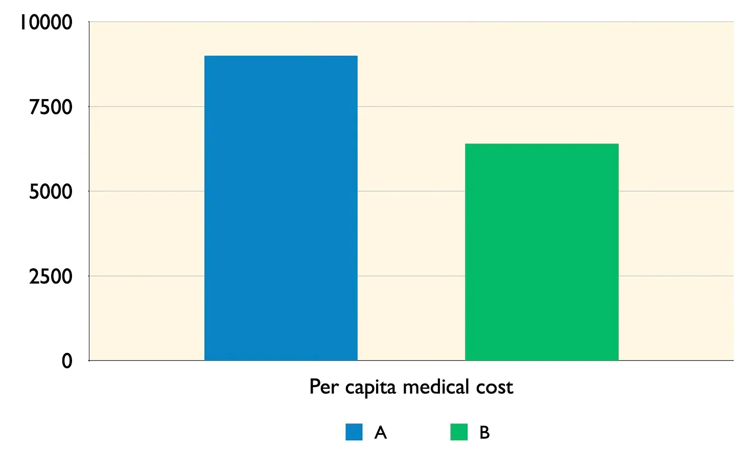
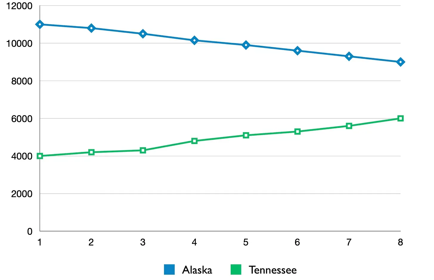
We often focus on the right levers to make positive changes, but sometimes, the results are unexpected. For example, lowering prices might seem like a good idea, but it can actually lead to lower sales in the long run. Similarly, building only low-income housing can create neighborhoods that become poverty pockets. It’s counterintuitive to remove low-income housing and replace it with mixed-use and mixed-income housing, which includes a range of low to high-income housing. The amount of solely low-income housing is a lever, and our emotional reactions to poverty often lead us to pull the right lever in the wrong direction.1
High-leverage
Have you noticed how often we have planning meetings where we adjust last year’s strategy or budget a bit? We might allocate slightly more resources here and less there. This tweaking approach could be called the Buckshot Strategy Planning Process. We believe that we need to use our scarce resources wisely, so we take a broad approach.
Suburbanites are often surprised when building new roads and adding more lanes to reduce traffic congestion only ends up causing more congestion a few years later. Reducing congestion encourages more development, which then increases congestion. Instead of trying to eliminate congestion, it’s better to accept road congestion and use that pressure to stimulate jobs closer to where people live or public transportation.
One insurance provider faced a challenge in maintaining enough claims processing staff. New hires quickly burned out dealing with stressed-out customers who wanted their claims processed quickly. The typical approach is to increase the number of people involved; we need more of them! So, the company hired more, only to find burnout and turnover continued to accelerate. They discovered a high-impact strategy. Develop the emotional intelligence (EQ) of the department, especially its senior leaders. This allowed the staff to interact with customers with greater empathy and reduced burnout. Additionally, senior leaders could support their staff by focusing on their well-being, which reduced turnover more.2
Our strategies often involve multiple physical aspects of the ecosystem. We increase inventory and buffers, build new facilities and infrastructure, and hire more staff. But it’s often more effective to focus on the less physical aspects: building skills, changing decision rules, reducing burnout, improving information flows, increasing incentives or penalties, and ultimately transforming the mindsets we use to make all decisions.
These high-leverage interventions, though rare in typical planning frameworks, become clear when we apply the skills of SysQ.
“It’s not that I’m so smart, it’s just that I stay with problems longer.”
— Albert Einstein
C. IMPLEMENTING & LEARNING
We start by defining a performance issue and building a model to understand it. Then, we come up with a hypothesis for how to improve it, which we call decisions, plans, or strategies. But even though we’ve tested our hypothesis using SysQ skills and tools, we still need to build confidence in it. And that confidence is best built as we implement the strategy.
Kurt Lewin said that to understand something, we should try to change it. As we learn from implementation, we can see what works and what doesn’t. This helps us figure out if we have the wrong strategy, if it needs to be changed a little, or if it needs to be changed a lot. A higher-leverage learning happens when we realize we’ve made a mistake in our thinking. Maybe we don’t fully understand the causes of the problem or we’ve chosen the wrong performance issues. We’re building ladders for the wrong wall.
Sometimes, we review and revise our sensemaking, which is called double-loop learning. Single-loop learning happens when we think we’ve figured everything out and only change our tactics to solve problems. Double-loop learning happens when we hold our beliefs as hypotheses and are willing to question them. We’re willing to change our thinking before we change our actions.
In the Implementation and Learning phase of the iterative learning process, our goal is to gather as much useful information as possible to confirm or disprove our strategy. We’ll look for leading indicators, keep an eye on them, analyze the data, and decide if we have the wrong strategy. If we do, we can try adjusting it using the same thinking we used to develop it. Or, we might realize we have a wrong understanding of the ecosystem or the performance issues we want to improve. In that case, we’ll double-loop and make any necessary changes to our assumptions. Then, we’ll go back through the process again.
“If you want to truly understand something, try to change it.”
— Kurt Lewin
SUMMARY
The SysQ Process is a super-powerful tool to tackle tricky problems in our crazy, interconnected world. Instead of jumping to solutions, it guides us through three main steps: first, we figure out what’s really going on and why; second, we come up with creative, unexpected, and super-effective solutions; and finally, we put those solutions into action while staying open to learning and changing our approach as needed.
At its heart, this process helps us avoid common pitfalls like building solutions for the wrong problems or fixing things that just make things worse. Instead, it helps us understand the real issues, see how they’re connected, and come up with truly transformative solutions. By doing double-loop learning, we can keep improving not just our actions, but also our understanding of the challenges we face. This iterative approach means our solutions get better and better over time, leading to lasting positive change instead of just temporary fixes.
The SysQ Process is actually pretty simple, and we all know the steps. But we often don’t spend enough time figuring out what’s really going on or challenging our thinking in ways that support double-loop learning. That’s why this substack is here! We’ll share examples, practical tools, and tips to help us use the SysQ Process more effectively and learn more by doing.
1
Meadows, D. H. (2015). Thinking in Systems. Chelsea Green Publishing.
2
Clark, K. et al. (July 2015). Using Systems Thinking to Shift Mindsets. [white paper]. International System Dynamics Conference, Boston, MA, USA
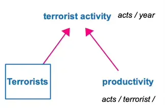
 Bad, right? Worried?
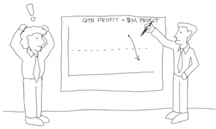
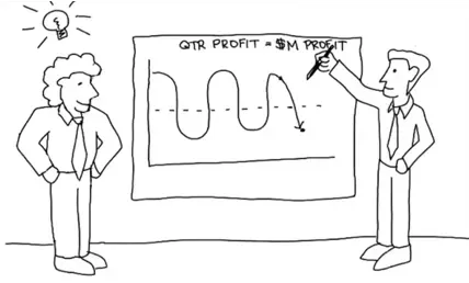 Now how do you feel?

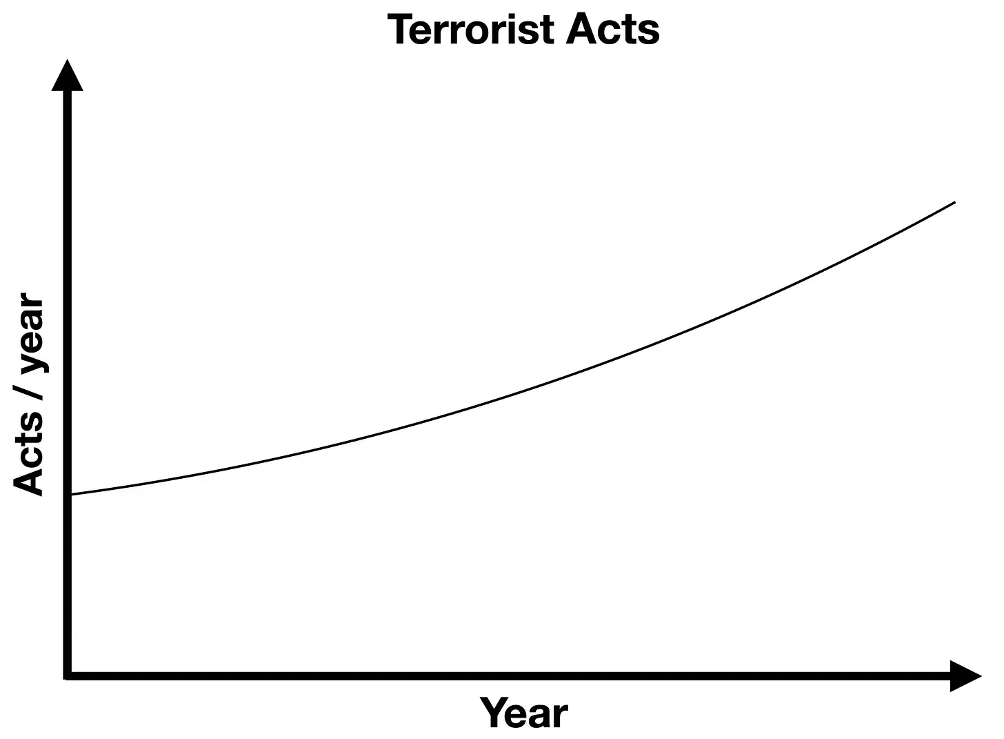
 LINEAR Thinking would suggest that an intervention that kills terrorists would work to reduce terrorist activity. However, by applying FEEDBACK LOOP Thinking we can see it will likely kill people who are not terrorists; this will motivate more potential terrorists to enroll in terrorist organizations and eventually be trained to commit acts. This would create a nasty reinforcing feedback loop (R1) known as a vicious cycle.
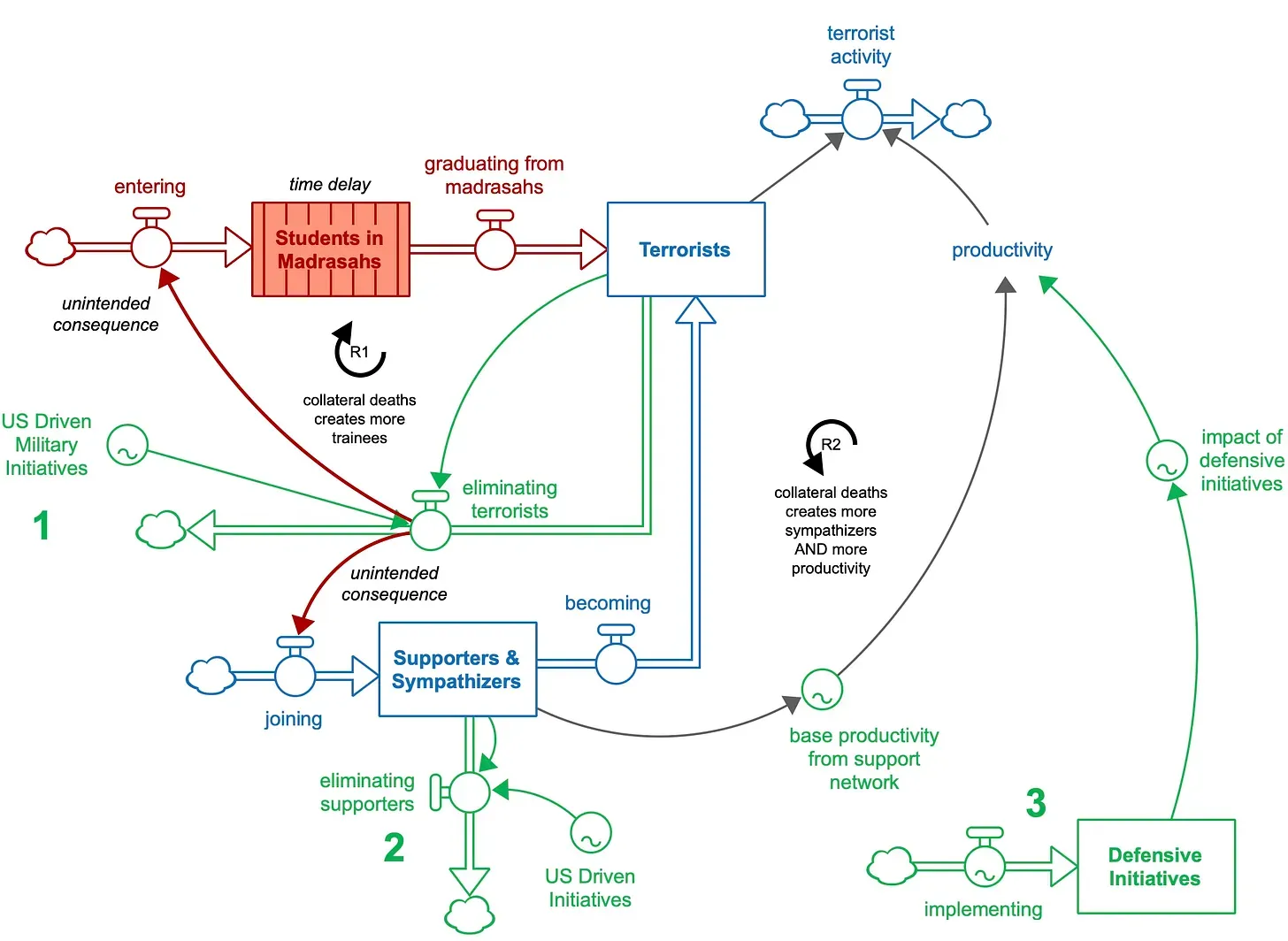


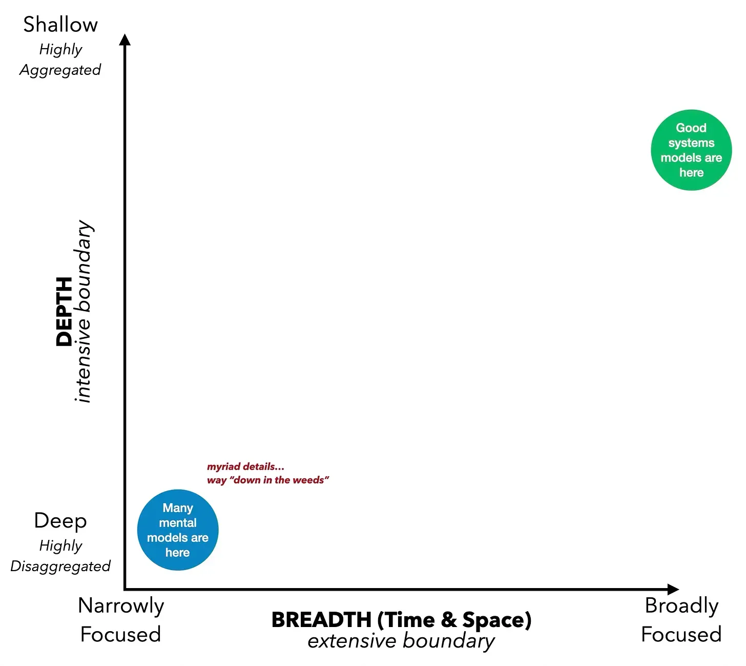
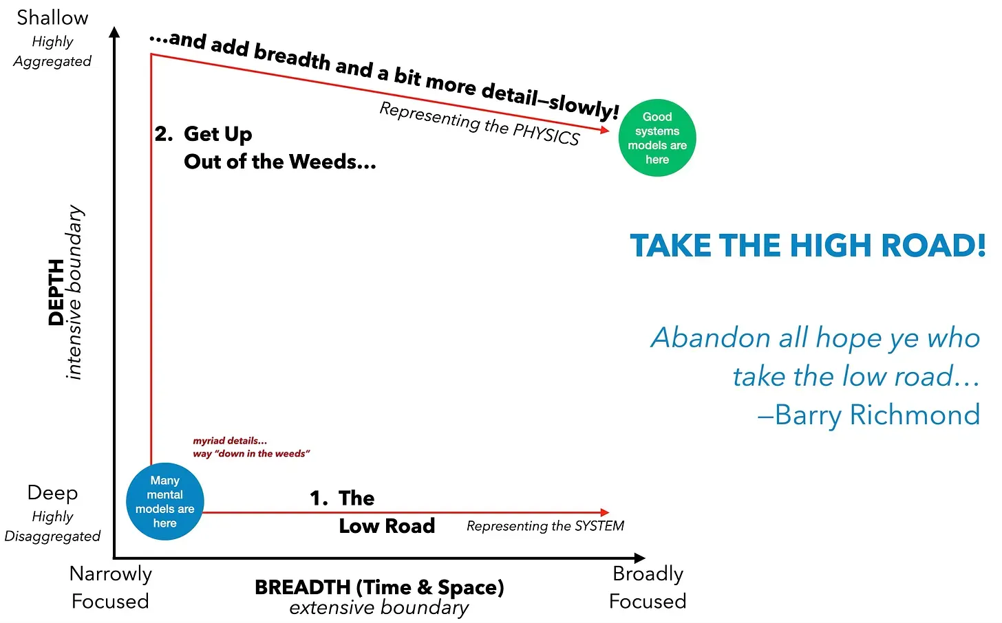 The High Road process involves sharing the initial “starter map” or “starter model” with others. Does it provide a clear explanation of why the performance issue is occurring? What changes or additions are needed? Make small adjustments and share the updated model for testing.